asfah AS media
Thursday, 1 May 2014
Film Opening: Evaluation
How did you attract/address your audience?
Who would be the audience for your media product? & particular social groups represented?
The target audience for our film was aimed at the 12A classification rating, we researched it further on the BBFC website and read through the typical features which are included within in each age rating and decided that 12A suited it the best; the summary of the rating can be seen here in detail: http://www.bbfc.co.uk/what-classification/12a-and-12. The components of our film opening match the film certification of 12A, for example, the film as a whole includes upsetting scenes which could be disturbing for a young child to watch without an adult by their side.The genre of our film opening was based on a thriller theme, which features conventions such as low key lighting and quick cuts etc. creating suspense that keeps the audience engaged. The type of audience we were aiming for were teenagers around the same age range as us, as it will appeal to them the most due to the similarities of their lifestyle which are apparent to the audience.
Overall, the film was aimed at both genders but appeals more to girls as it's easier for them to understand the scenario with the image in mind, that they can relate to the situation and problems highlighted by the main character. The main character is a victim of a past disaster. As the nationality of the film is British, the image is very gritty looking, as it's made with a low budget and set in England. British actors are used, as well as common British locations to emphasize the culture of origin. Our film would appeal to the niche market, as it is an Independent British movie, made with a low budget. Regarding the particular social groups which are represented in our film opening, we highlighted the stereotype of a typical troubled teenage girl, through the clothes she wore in the mise en scene and the body language she encountered, making it apparent to the audience, how she is feeling. The main character (Crystal) is 16 years old and appears distant and confused after the impacting accident in her life, presenting the characteristics of her personality.
What kind of media institution might distribute your media product and why?
In what ways does your media product use, develop or challenge forms
and conventions of real media products?
Screen caps to visually portray typical thriller conventions included in our film opening:
What have you learnt about technologies from the process of constructing this product?
In terms of filming, I have learnt a wide range of camera angles which are used for specific shots in scenes. As we used digital cameras, I learnt how different lenses were used for particular shots: it includes 3 types of lenses [35mm, 50mm and 75mm] which enable you to capture a long shot, mid-shot and close-up shot for your frame shot in the scene. Using the DSLR camera's resulted in clear, quality footage giving off a professional look and high resolution. We also used a tripod to keep specific shots steady and additionally used the handheld camera method, generating enigma in the scene as it makes it look more realistic to the audience. In addition, for most of our scenery shots we used the steady cam, as the camera glided along the location smoothly, resulting in a professional finish. This was my first time using a steady cam and it was interesting to see how metal weights balance the camera, composing a smooth glide.
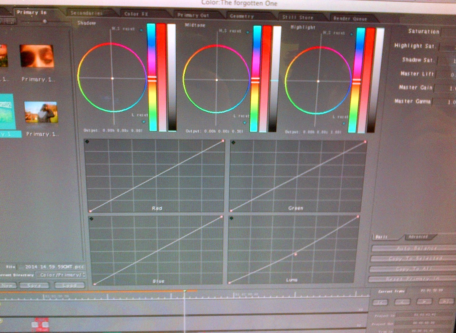
The microphone attached to the camera enables HD quality sound to be recorded, in our case we wanted to capture ambient sounds such as the river flowing in the background, however, we didn't go ahead with this idea as it didn't fit in with the rest of the film opening, with the continuity. Editing the film opening was intriguing as I developed my knowledge on Final Cut Pro as a software, I learnt how to edit: colour, lighting, transitions, titles/credits, music/arts and editing with HD footage. In particular, colour grading each scene to make sure all the colours enhanced were relatively dull, connoting that depressing tone and mood. Furthermore, for research we used You Tube as a search engine discovering past film openings with the similar genre, picking up ideas and combing them together.
I also learnt how to compose animation video portraying our storyboard in a slide show form, generating a clear view of how the film opening will follow. Digitization allows our film opening to go onto YouTube, distributing it on a viral level using the [below the line] method, which opens it up to a potential wide audience as. With the development of digital technology, we were able to make a film for free and distribute it.
Looking back at your preliminary task, what do you feel you have learnt in the progression from it to the full product?
During the preliminary task, I learnt the basic filming techniques and how each scene continues from one another using clear continuity throughout. I have learnt all the different types of angles which can be used in a shot, signifying different emotions and power over different characters, for example, a high angle shot shows a character who is weak and hopeless. As the character in our film opening was a vulnerable person we wanted to portray that using a variety of techniques. In comparison, filming the film opening was much more efficient as opposed to when I was doing the preliminary task because as a group we were very organised and worked together as a team to elaborate how to get it to the best standard possible. There was definite development in the way we filmed as it was more detailed and relevant towards the theme of our film, emphasizing the genre of a physiological thriller. I increased my knowledge on how to edit, learning new effects and tools which are used to enhance the clarity of the film itself and also how to convert a file to quick time and upload it to YouTube, where it would eventually be distributed on a viral level. In addition to this, I learnt how to create a slow motion effect on the footage and how to fade out the tone of the sound/music at the end of the scene.
Audience Feedback:
Anoop Johal:
Positive: The setting helped feel the emotions of the character.
Negative: Some dialogue would have helped understand who the character is.
Who would be the audience for your media product? & particular social groups represented?
| BBFC 12A Classification |
 |
| British Location |
What kind of media institution might distribute your media product and why?
In what ways does your media product use, develop or challenge forms
and conventions of real media products?
Screen caps to visually portray typical thriller conventions included in our film opening:
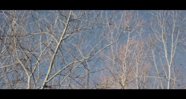 |
| Low Key Lighting. |
 |
| Not revealing the characters at first. |
 |
| Close-Up Shot. |

What have you learnt about technologies from the process of constructing this product?
In terms of filming, I have learnt a wide range of camera angles which are used for specific shots in scenes. As we used digital cameras, I learnt how different lenses were used for particular shots: it includes 3 types of lenses [35mm, 50mm and 75mm] which enable you to capture a long shot, mid-shot and close-up shot for your frame shot in the scene. Using the DSLR camera's resulted in clear, quality footage giving off a professional look and high resolution. We also used a tripod to keep specific shots steady and additionally used the handheld camera method, generating enigma in the scene as it makes it look more realistic to the audience. In addition, for most of our scenery shots we used the steady cam, as the camera glided along the location smoothly, resulting in a professional finish. This was my first time using a steady cam and it was interesting to see how metal weights balance the camera, composing a smooth glide.
 |
| Creating Animation Video |
I also learnt how to compose animation video portraying our storyboard in a slide show form, generating a clear view of how the film opening will follow. Digitization allows our film opening to go onto YouTube, distributing it on a viral level using the [below the line] method, which opens it up to a potential wide audience as. With the development of digital technology, we were able to make a film for free and distribute it.
Looking back at your preliminary task, what do you feel you have learnt in the progression from it to the full product?
 |
| Slow Motion on Final Cut Pro |
 |
| Sound Adjustment |
During the preliminary task, I learnt the basic filming techniques and how each scene continues from one another using clear continuity throughout. I have learnt all the different types of angles which can be used in a shot, signifying different emotions and power over different characters, for example, a high angle shot shows a character who is weak and hopeless. As the character in our film opening was a vulnerable person we wanted to portray that using a variety of techniques. In comparison, filming the film opening was much more efficient as opposed to when I was doing the preliminary task because as a group we were very organised and worked together as a team to elaborate how to get it to the best standard possible. There was definite development in the way we filmed as it was more detailed and relevant towards the theme of our film, emphasizing the genre of a physiological thriller. I increased my knowledge on how to edit, learning new effects and tools which are used to enhance the clarity of the film itself and also how to convert a file to quick time and upload it to YouTube, where it would eventually be distributed on a viral level. In addition to this, I learnt how to create a slow motion effect on the footage and how to fade out the tone of the sound/music at the end of the scene.
Audience Feedback:
Anoop Johal:
Positive: The setting helped feel the emotions of the character.
Negative: Some dialogue would have helped understand who the character is.
Danielle Bui:
Positive: There is emotive music which made me fear the unknown.
Negative: Needs more interaction between character to show relationship between each character.
Wednesday, 12 February 2014
Film Opening: Editing
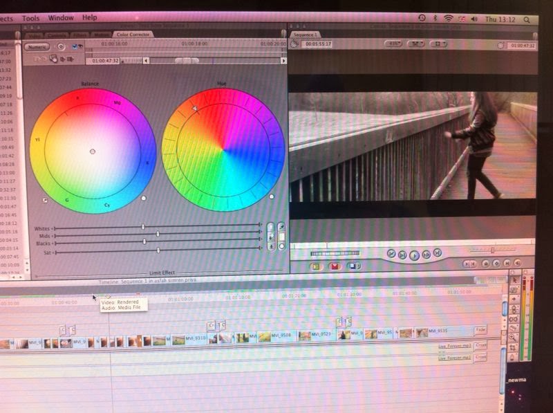 During the process of editing our film opening, I have learnt a range of new skills which I will take forward with me. In this image, it displays the way my group and I used the colour grading to turn coloured footage to black and white. We had to use the colour corrector tool which then came up with a colour wheel and some buttons which you use to adjust the specific colour. As we wanted to turn this particular part of the footage black and white, we turned the saturation down and made sure the contrast levels were balanced.We decided to use a black and white format for the 'flashback' scenes because we felt it made it seem more real like your going back in time, making it evident for the audience to understand clearly.
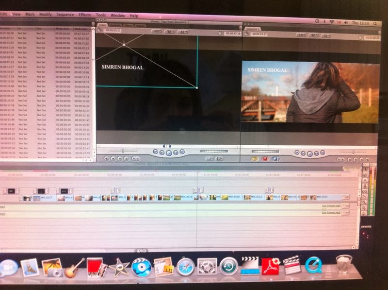
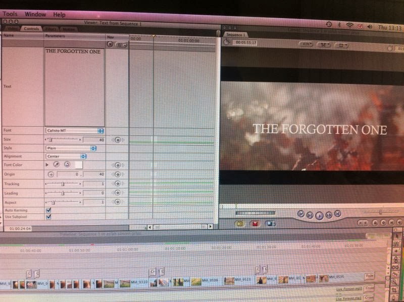 We also added a slow motion effect to this footage by changing the speed to 65%, adding to the enigma being created.I also learnt how to put a letterbox format onto the footage, which presented it in a wide screen format, where the image is displayed in approximately its original proportions across the middle of the screen, leaving horizontal black bands above and below. In addition, I also learnt how to fade out music using a specific tool which enabled me to control the audio levels and choose where I wanted the music to fade out. Moreover, The font we used is called Calisto MT and we decided to use it because it had an elegant effect but slight edge to it, connoting the theme of our story. Our teacher recommended that we use the same font throughout the whole film opening to portray clear continuity. We positioned the titles in various ways throughout the film opening, spreading out the duration of each credit appearing to display a smooth flow.
 Tuesday, 11 February 2014
Research & Planning: Risk Assessment
In the film industry, risk assessments are often written out to ensure health and safety actions are pursued and helps the film crew identify hazards and control the risk they create for those involved in the production of the film or even people in the public. The process requires you to take time to look at the location's surrounding area and decide the hazards which are present on set, you then have to assess the risk of people being exposed to these hazards and find ways to either eliminate or control them.
Monday, 10 February 2014
Research & Planning: Renaming Film Title
Friday, 7 February 2014
Research & Planning: Film Opening Analysis: Inception
In my group, this was one of the first openings we decided to look at as inspiration regarding our genre and the specific type of story line. This movie is a psychological thriller and keeps you guessing until the end which is what makes it so engaging. The film opens with a close up shot of the waves flowing with speed in the sea, you can hear the diegetic and ambient sound of the water in the background; creating enigma. This specific shot sets the scene and mood of the movie with the parts of the location and scenery shown. A panning shot is then used to reveal parts of a character who is laying on the shallow part of the coast by the water and it shown through a relatively blurred shot as you cannot see him sharply, leaving the audience confused. Next, the back of a young boy is shown playing with the sand and laughing which creates tension as the two shots contrast from each other, keeping the audience engaged. It then goes back to the character laying down, building the character up by using different shots is effective and i want to pursue this in our film opening. Another character is then introduced who is a little girl playing with the boy and laughing, contrasting emotions towards the man laying down who has a tortured emotion shown through his facial expressions. After this, a low angle shot and point of view shot is used to introduce the group of men who have guns, this portrays them as having authority and power over the character laying on the coast, also creating suspense as audience become shocked and worried. A long shot is then used revealing more of the location, the scene then cuts straight to a new setting inside a building, the colours and lighting are dark and low key generating a mysterious atmosphere. An over the shoulder shot is used to introduce another character from the view of someone else in the background. The close up shot of the object spinning creates tension and enigma as it can have a range of meanings behind it, leaving the audience clueless. I like the way a small object has such a big impact and foreshadows the rest of the movie, the way the story unfolds slowly is really effective because it plays with your mind.
Thursday, 6 February 2014
Subscribe to:
Comments (Atom)


